Nigel Smink
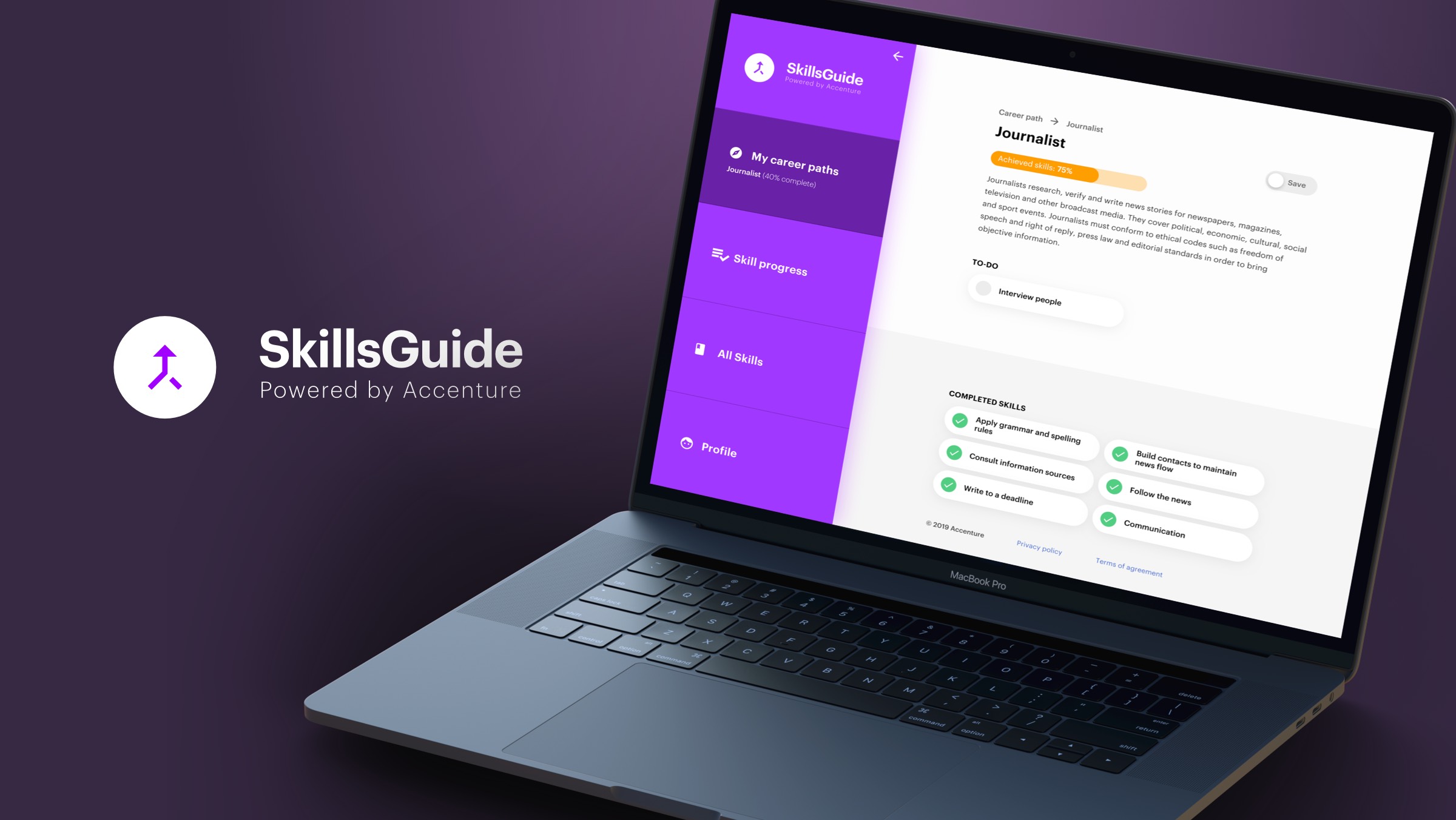
SkillsGuide


After extensive research and many workshops, we eventually came with the SkillsGuide concept. A (web)app that helps users figure out which skills they already have an which are transferable amongst different professions.
Below is a case study of the project, including personal insights and learnings. Throughout this project I was the sole designer, meaning my work consisted of UI, UX as some service design. That being said, I am grateful for all the help and support I received from my fellow colleagues at Accenture Interactive.
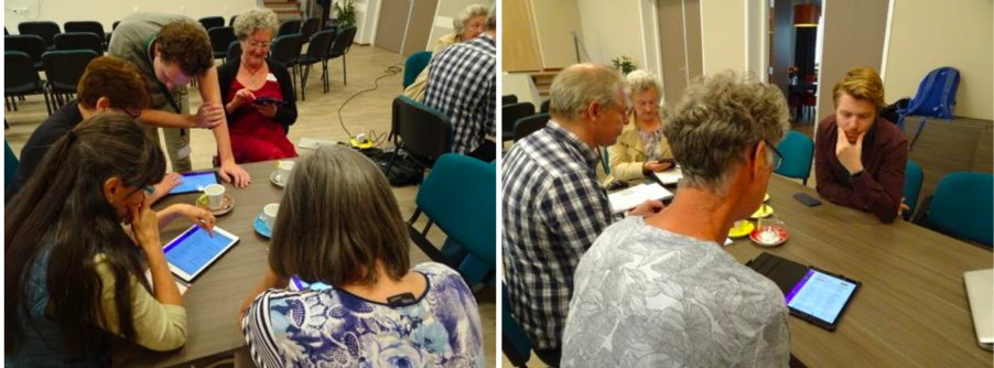
Once the concept was validated, we set out to build the platform. This is where the overall user experience and interface validation started. One important factor during these validations was negating for bias, as participants generally were very grateful for our efforts on their behalf, and hence we encouraged them to be as honest and forthcoming as possible.
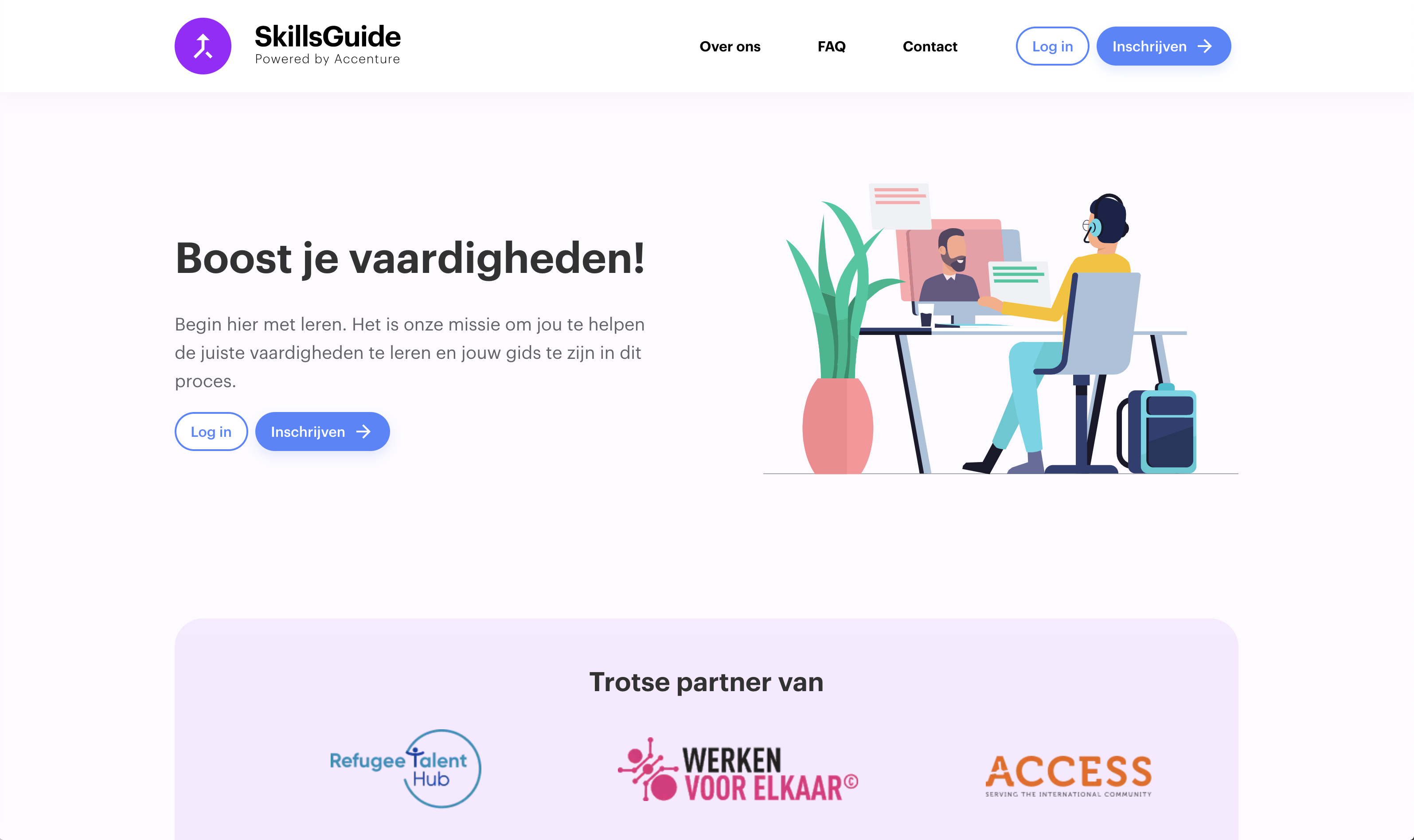
Storytelling is arguably an important part of any product or service. It should be as easy as possible for a user to understand the concept and realise why it might be valuable to them. For this reason, I had originally conceived of a much more animated landing page, where the story of SkillsGuide was unfolded and told while the user scrolled down the page. However, given the amount of work required to properly build this, other aspects were prioritised. In that sense, I'm looking forward to projects where such fidelity is feasible.
Additionally, we used Lottie animations on the landing page to increase engagement, however, unfortunately we decided to remove them given the performance ramifications, specifically in regard to SEO. Luckily, some are still available in the webapp.
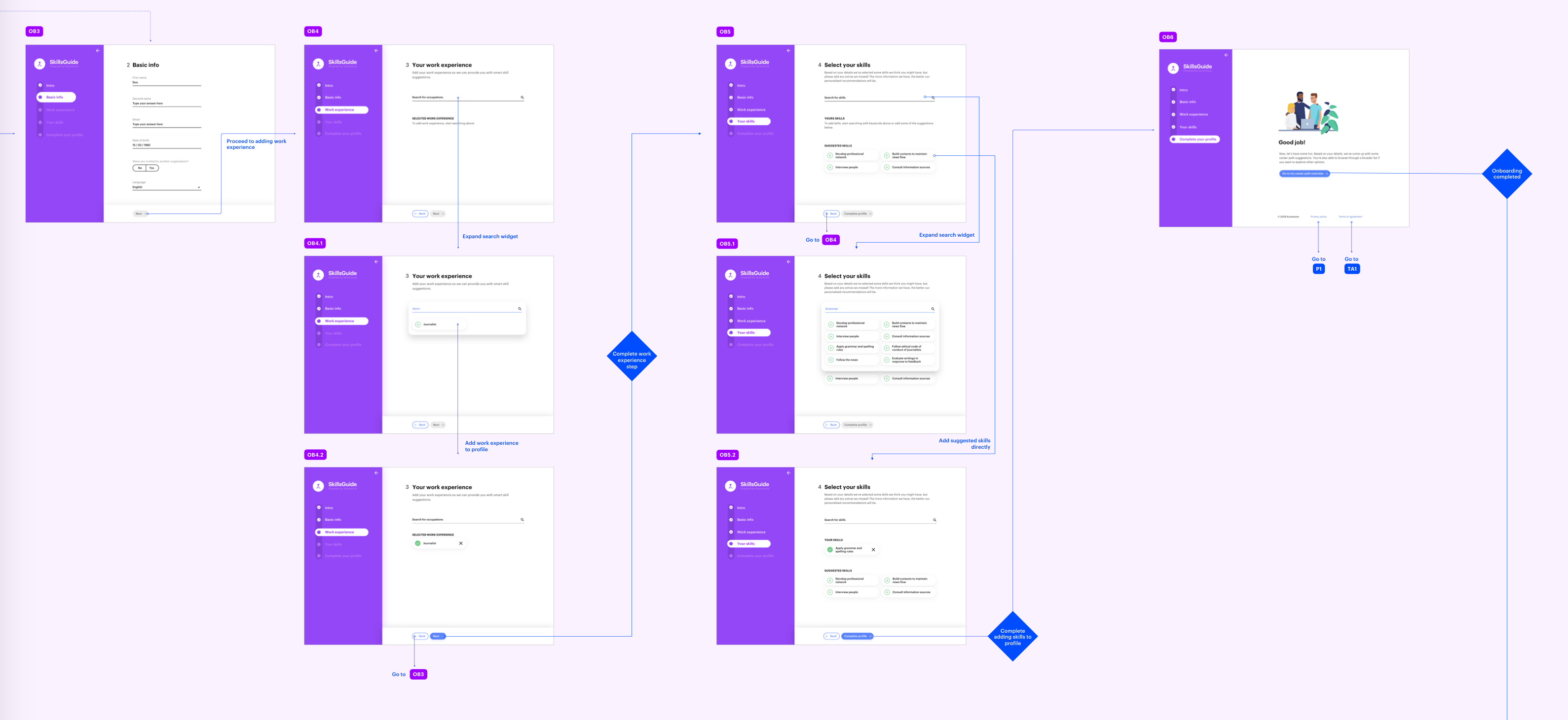
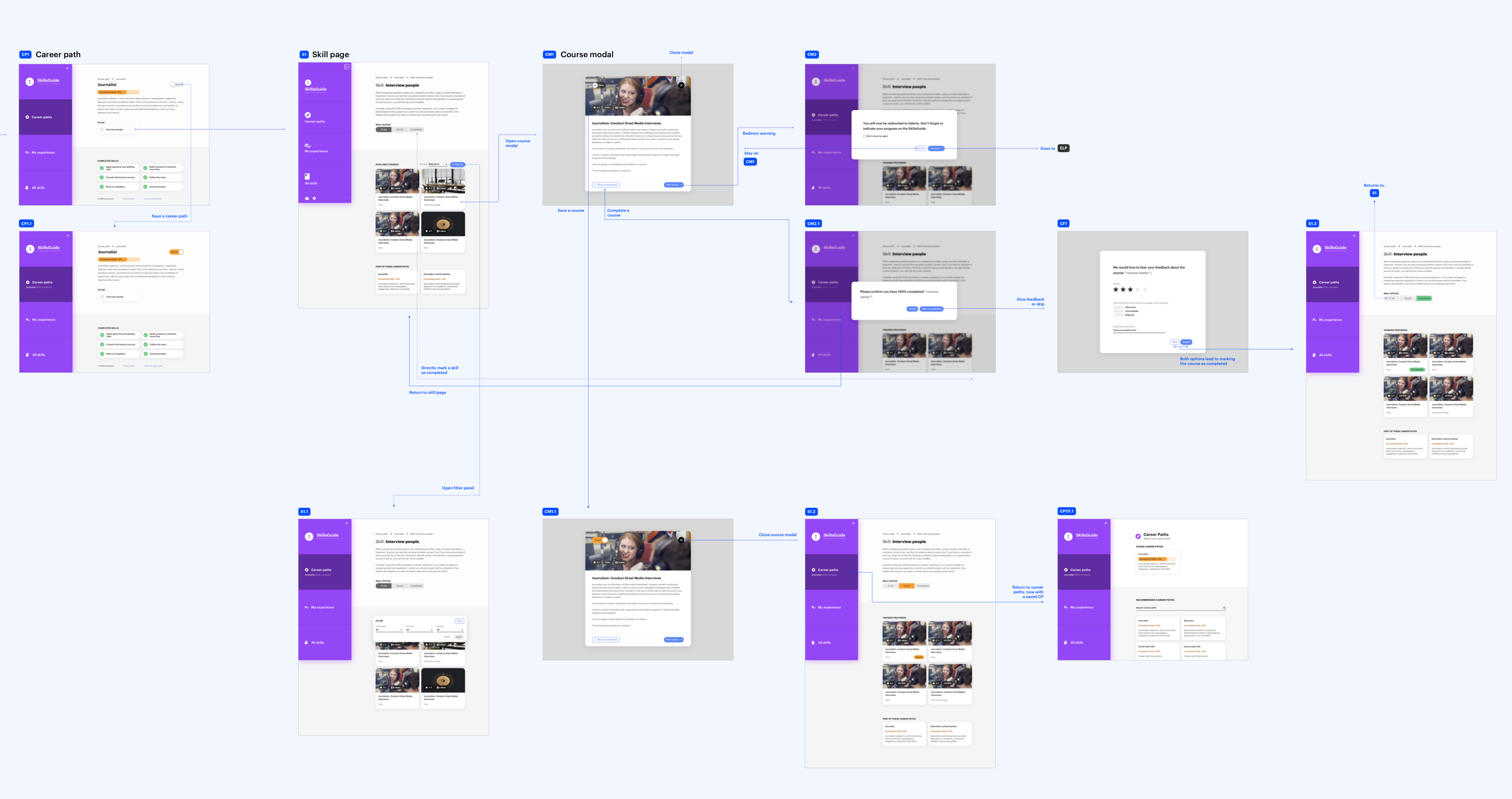
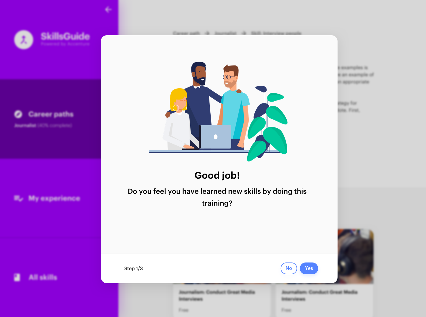
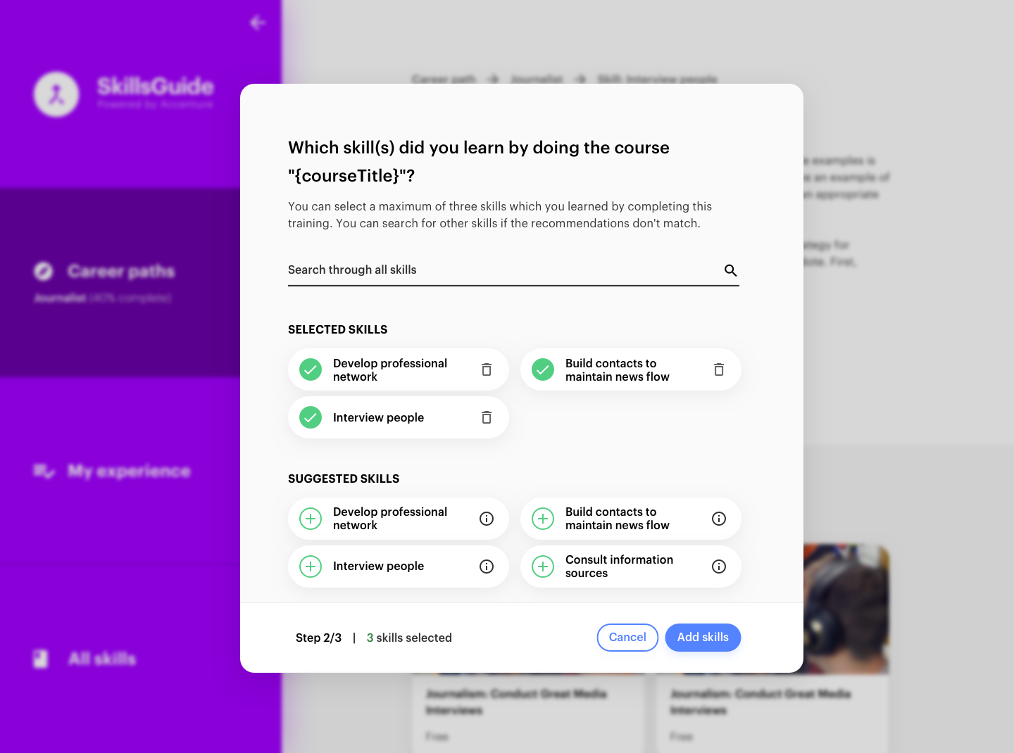
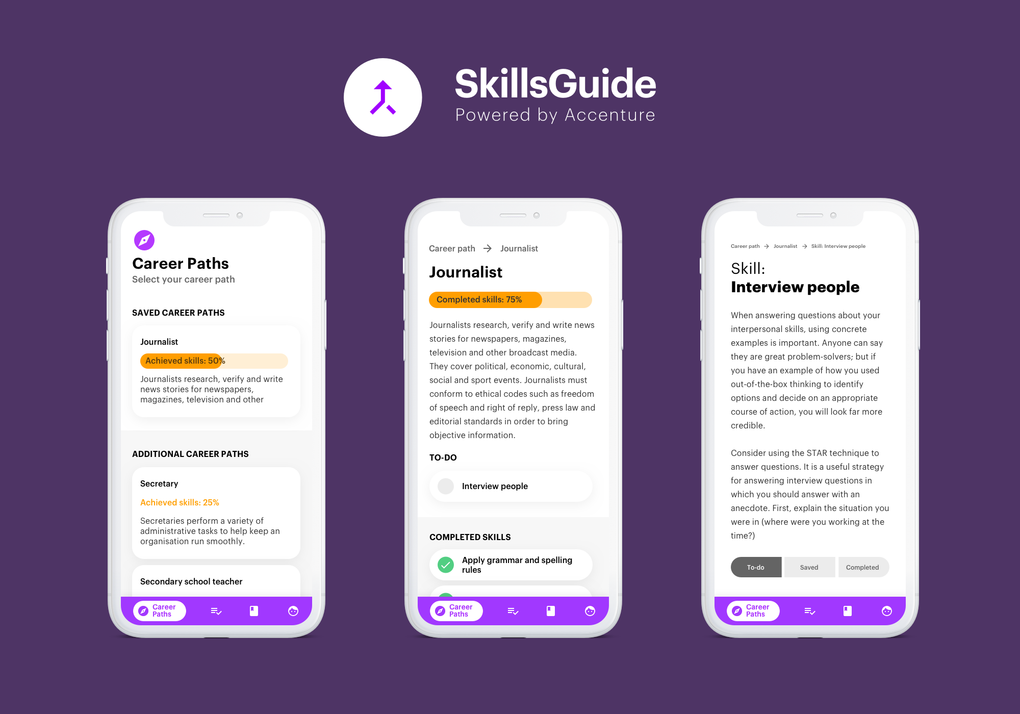
Above are sniplets of some of the user journeys available in the app. Of course, unhappy paths were also developed, especially considering leakages to other platforms (learning providers) happy regularly. During user testing it was clear that not all users (especially users of age) noticed they were being redirected, despite the other website looking totally different. We made this very clear by using an indication which can be hidden after the first occurrence.
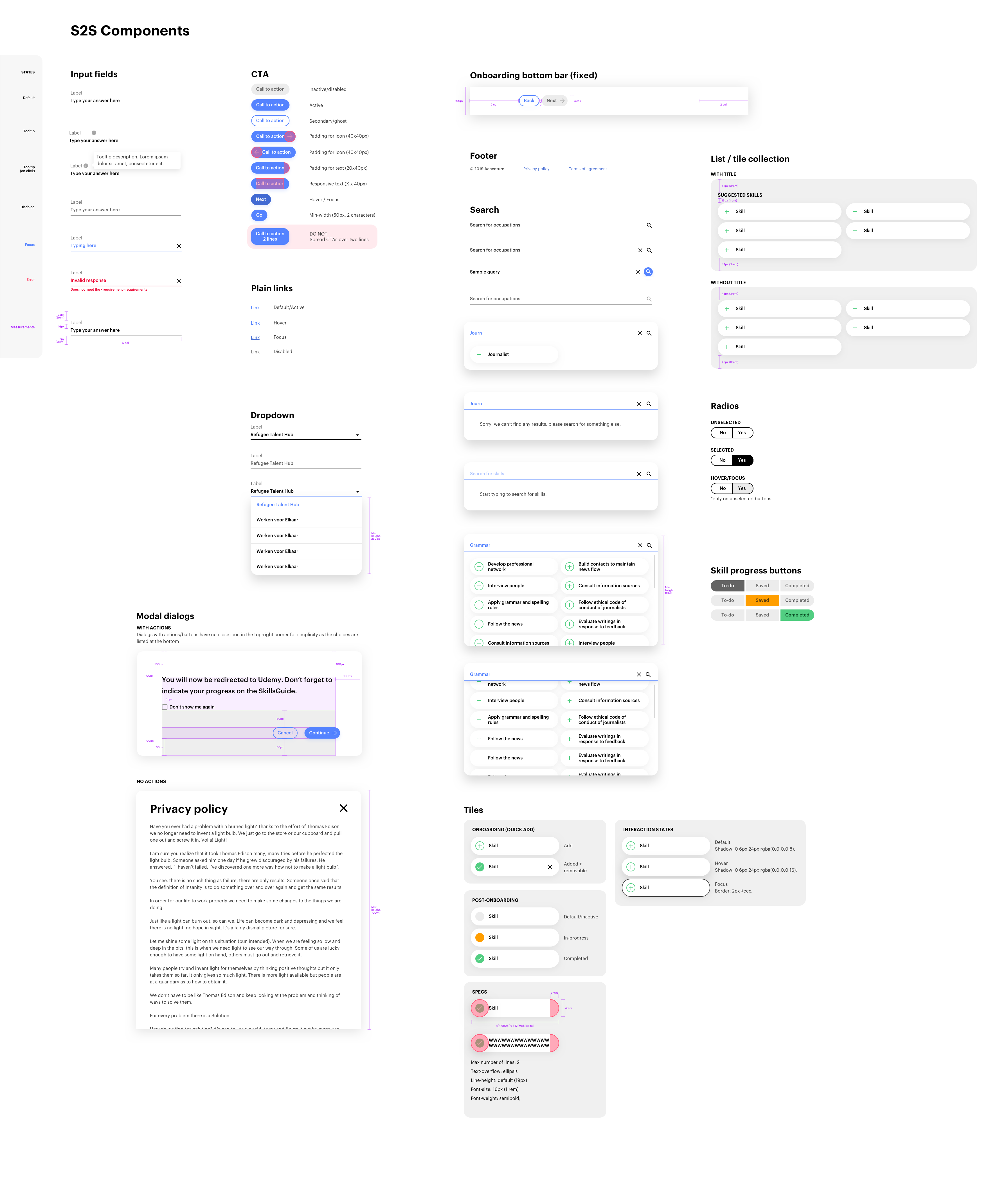
Given the scope of the project, we created a relatively simple design system. However, in the future I look forward to developing one further. I especially look forward to being able to sync design changes with their programmed counterparts automatically. E.g. by syncing React components with a design tool like Framer X.
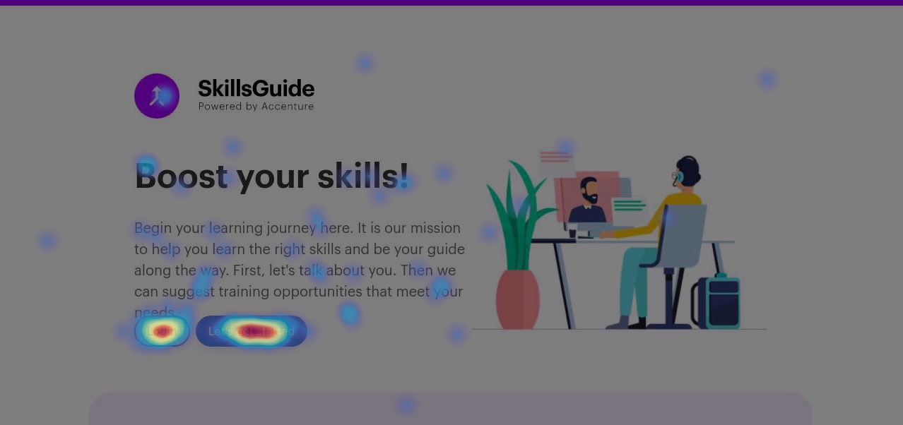
To accomplish this, we used tools like Hotjar, Google Tag Manager and Analytics. Analysing all this data at a larger scale made it easy to come up with actionable insights to improve the user experience.
One take away I'd like to share, is that we tried to use Material UI Components for React when applicable. This huge library had the major advantage of saving a lot of time which could then be used for other aspects. However, it is very important to remain vigilant, because these UI components might not work as well as you hope, or perhaps haven't been validated with users sufficiently. To give you an example, the Material date picker we used, ended up being very user unfriendly, at least in particular with our target users, because the year selection field was quite hidden away. This had the painful result that users would keep on hitting the previous button (per month) to eventually get to the year in which they were born. That can take a lot of time! The moral of the story is to always validate all UI components, even if they're already mainstream and popular.